I admit that I hadn’t consciously noticed the trend of how every Hollywood movie seems to be going for a two-tone palette nowadays, but this eye-opening piece lays it out in irrefutable detail:
You see, flesh tones exist mostly in the orange range and when you look to the opposite end of the color wheel from that, where does one land? Why looky here, we have our old friend Mr. Teal. And anyone who has ever taken color theory 101 knows that if you take two complementary colors and put them next to each other, they will “pop”, and sometimes even vibrate. So, since people (flesh-tones) exist in almost every frame of every movie ever made, what could be better than applying complementary color theory to make people seem to “pop” from the background. I mean, people are really important, aren’t they?
[…]
From this seemingly innocuous supposition was unleashed a monstrosity that would eventually lead to one of the worst films ever, and one of the worst examples of unchecked teal and orange stupidity
The screenshots are hilarious, but at the end he takes teh same principle and applies it to classic works of art, and the result is utter genius:

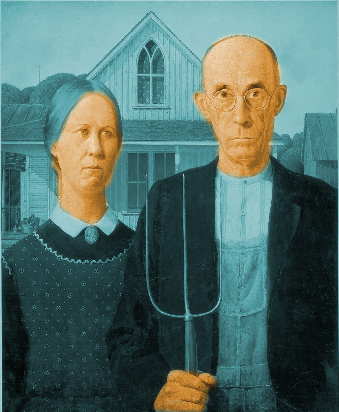
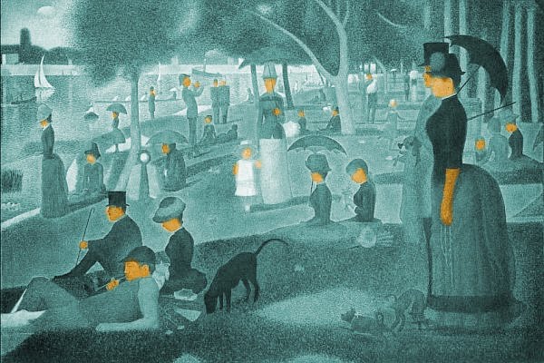
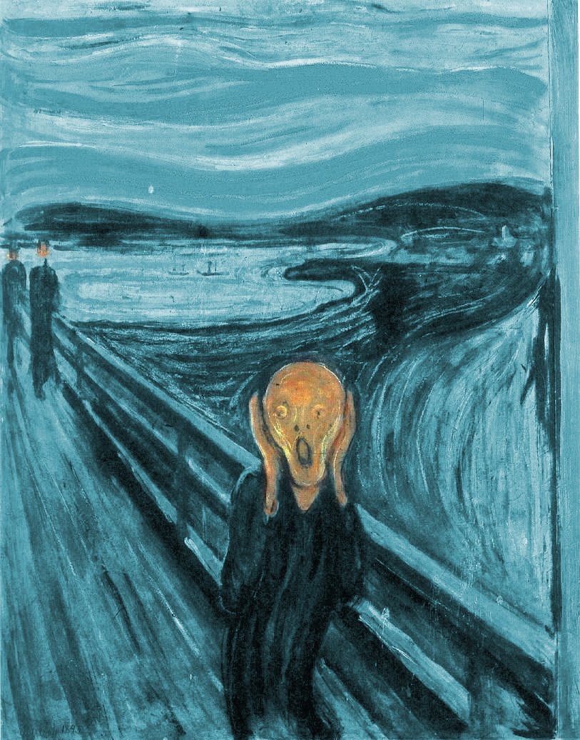
I’d LOVE to see someone do this for more pieces of art.
It occurs to me that our politics is similarly two-tone, carefully calibrated for maximum opposition and “pop”.