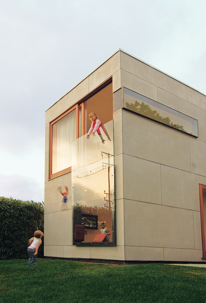
The whole Modern Art movement to me can be summed up as, “boxes are cool”. I’m not being snarky; I really think that there’s a fundamental cubic aesthetic which is cool because of its clean lines really appeals to people. For some reason I am also reminded of the satisfying way in which all my boxes stacked nicely in the moving truck, too – with cubes, you can stack and assign and subdivide a volume in infinite ways. This also probably accounts for the almost primal appeal of Tetris. The boundaries between these sub-volumes don’t have to be explicit (as they are with cardboard boxes) nor do they have to be rigidly cubical – they can be two-dimensional or even swap back and forth between dimensions (like a living space that suddenly extends upwards into an atrium).
Of course Apple is a pioneer in embracing this cubical ethos; its products and packaging are famously clean-lined and cubical. People actually make a fetish out of “unboxing” Apple products! However, I think that consumer goods are a minor branch of modernist design; it’s really architecture where modernism rules and also serves as the primary vehicle. Of course Apple has its NYC store on 5th Avenue, with it’s all glass facade above ground. I think they were trying to be both modernist and also evoke The Louvre Pyramid at the same time. But as far as architecture is concerned, I think of Apple as an amateur. To get a sense of where the real innovation is happening, check out Dwell Magazine. For example, this incredible house in SoCal, built to take full advantage of the climate:
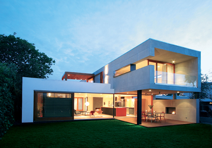
That’s an outdoor dining room on the ground floor, and a guest bedroom above it with outdoor sleeping area. And check out the way they use a single piece of tempered glass as the window for the study as well as a railing for the upstairs bedroom!
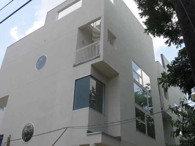
This kind of cool design isn’t limited to SoCal, but it does seem to be more prevalent in warmer climates. In fact a friend of mine is an architect in Houston (FS Design Build) and he has designed some amazing properties in the Museum District that have the same kind of open, clean aesthetic. Here’s an exterior shot:
and an example of the open design of the interior – the kitchen and dining area:
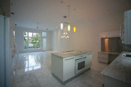
That’s another gigantic window at the far end of the room, spanning multiple floors. The whole place is just wide open from top to bottom. This is the kind of space that being the neanderthal I am, I’d probably fill with Ikea. Then again, if I could afford this kind of house. maybe I could afford some higher-end furniture, too. Still, Ikea is modernism for the masses, and the same cubical, clean aesthetic applies.